“I don’t try to express ideas or provoke emotions, I focus on the shape-color relationship.”
Jerome Tham Vo My’s artistic process and style
He is Jerome Tham Vo My, born in Paris in 1967, who has possessed a natural inclination for drawing since childhood. He pursued formal education in painting, applied arts, typography, graphic design, and visual communication for five years at the renowned Estienne school in Paris during the 1980s. After completing his studies, he established himself as a successful creative director and graphic designer, which has significantly influenced his artistic endeavors. His art is marked by an attention to detail, precision, and a constant need for evolution, with each series crafted with a precise concept and global vision.
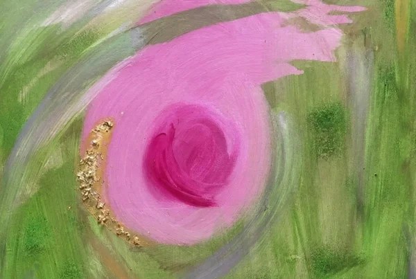
Jerome Tham Vo My employs a diverse range of mediums to express his creative vision. Jerome current focus is on producing a series of abstract and graphic works, where color takes center stage as a defining vector. His artistic objective is to challenge the conventional boundaries between the visible and the invisible through the use of form and color, creating a sense of fluidity and dynamism in his compositions.
Unlike some artists who aim to elicit specific emotions or ideas, Jerome’s work centers on exploring the intricate relationship between form and color. He approaches his creative process with a research-driven mindset, studying the fundamental elements of the line, the circle, and color. Utilizing digital manipulation techniques, Jerome repeats, augments, and sometimes even contradicts a single line or shape, resulting in a form-color combination that becomes an amplified version of itself. This amplification process creates a system of tensions and contradictions that extends beyond the canvas, giving rise to an entirely new dimension.

Jerome Tham Vo My’s inspiration and work environment
To enhance the visual impact of his works, Jerome coats each canvas with a matte gel that is streaked in a particular pattern. This gel serves as an additional link that ties the colors together, uniting them into a cohesive whole.
In his current situation, Jerome Tham Vo My enjoys the practicality of working from home. He appreciates the ease with which he can transition between digital and canvas mediums, as well as the ability to cook, engage in familial conversations, sketch, and listen to music, all while avoiding a rigid schedule. Furthermore, Jerome delights in the freedom to attend art exhibitions, go shopping, and engage in multiple activities simultaneously without any hindrance. Despite Paris being a smaller capital compared to others, Jerome finds solace in the city’s vast and remarkable cultural scene, making it his preferred location for both work and life. The only issue he encounters in his current studio/home is the low ceiling, which often prevents him from creating larger canvases. As such, Jerome may have to contemplate moving to a more accommodating space.
The artist draws inspiration from the artistic practices of Franck Stella and Gerhard Richter, which have driven him to pursue painting as a medium of creative expression. He is particularly drawn to their works which prioritize the pure visual experience over narrative elements. From an early stage, Jerome has explored the use of color in his artistic endeavors, experimenting with blending gouache, inks, and acrylics on paper, in notebooks, and on canvas. As he began incorporating digital techniques into his work, he discovered the vast possibilities of color mixing, including addition, subtraction, superposition, and inlay. These mixtures, coupled with the intensity of digital color, have given Jerome’s work a newfound presence and potency. His inspiration primarily stems from an ongoing investigation into the interplay between color and form. While the combinations of colors and shapes can convey endless narratives, Jerome believes that it is ultimately the viewer who holds the power to interpret and derive meaning from the visual language presented to them. His work, therefore, aims to offer a richly textured and nuanced exploration of the interplay between form and color, while leaving ample room for individual interpretation and personal connection.

Evolution of Jerome Tham Vo My’s artistic style and preferences
Jerome Tham Vo My had a period in his artistic career when his works showcased relatively simple shapes and flat colors. However, his style gradually evolved towards a more complex aesthetic, with increasing prominence given to gradients and a merging of colors, coupled with disappearing shapes and lines. Presently, Jerome Tham Vo My has returned to a more simplistic approach, favoring a less intricate artistic style.
When it comes to Jerome Tham Vo My’s artworks, he tends to exhibit a greater sense of pride in his latest series, while feeling less content with the one that preceded it.
Jerome Tham Vo My’s “Chromalibre” series is characterized by an interconnectedness that goes beyond visual aesthetics. The titles of each painting highlight three dominant colors, playfully named “Caca d’oie” for greenish-yellow, “Cramoisi” for deep red bordering on purple, and “Evêque” for a shade of purple varying in intensity inspired by the traditional attire of bishops.
The canvases, which all feature a graphic link, are titled “Mimosa Caca d’oie Lilas # Lalala,” “Lilas Citron Absinthe # Douce Étreinte,” and “Absinthe Jonquille Garance # Insouciance,” respectively. Moreover, the final color of one painting becomes the initial color of the next, establishing an organic flow between each artwork.
Jerome Tham Vo My created roughly fifteen canvases that are all intrinsically connected to one another. The overall color scheme for the series involves using a “mimosa” yellow in the first canvas, a “night” blue in the last, and colors ranging from yellow to dark blue (such as green, orange, magenta, red, light blue, burgundy, purple, and dark blue) to create a linkage between each canvas.

Jerome Tham Vo My: Exploring What Lies Ahead
For several years, Jerome Tham Vo My has harbored a concept for a sculpture project that similarly incorporates themes of connectivity, graphics, and color. The totems he envisions would be exceptionally tall and vertical, composed of approximately fifteen blocks stacked atop one another with a coherent color progression. The totems would be interactive, with the option to switch the base block with another totem’s block, resulting in countless possible combinations. Each block would be 3D-printed with Jerome Tham Vo My’s colored shapes, although this idea remains unrealized since he has yet to discover a 3D printer capable of creating these blocks at a reasonable price. However, Jerome Tham Vo My is optimistic that technological advancements will soon make this project feasible.
Jerome is an artist who embodies eternal optimism. He firmly believes that a positive outlook is vital in creating art. He is driven to produce art that evokes a sense of liberation, using color as his primary means of expression.
Jerome is committed to his craft, working meticulously and with unwavering self-assurance. He is convinced that anything is possible with hard work, motivation, and precision, and he imparts this philosophy to his children and to those around him.
Through his art, Jerome gains a broader perspective on life. His work inspires him to ponder the most profound questions and contemplate the importance of the seemingly insignificant. He views the world through a lens of optimism, always seeking out the good in people and striving to help others better understand the world.
Jerome believes that tomorrow will always be a better day, filled with greater opportunities for artistic growth and a better world. Art shapes his worldview and imbues him with a sense of hope and positivity.