
Form Reimagined: From Communication to Sensation
In the work of Daniel Escudeiro, typography is not just a vehicle for language but a sculptural force charged with meaning, emotion, and provocation. Based in Rio de Janeiro, Escudeiro is a Creative & Design Director who has steadily forged a signature style that straddles the edges of speculative design, visual identity, and material exploration. Having served as creative director at the former branding agency YONE in São Paulo from 2020–2024, Daniel now works independently, guiding projects that merge high concept with local resonance. With over 20 years in the industry, his contributions to global branding for companies like Adobe, Apple, Coca-Cola, and Meta are infused with a distinct voice that resists conformity.
Educated in Graphic Design at the Universidade Federal do Rio de Janeiro, Escudeiro’s creative journey began with formative internships at institutions like Casa da Ciência and Pós Imagem. He went on to hold leadership roles at major Brazilian design studios, most notably serving as Creative Head at Tátil Design, a studio widely recognized for its influence on branding and visual identity within Brazil. This trajectory has given Escudeiro a foundation rooted in traditional design principles, yet his work consistently transcends the expected, refusing to settle into static categories. His name has become synonymous with daring visual language, pushing type beyond legibility into the space of experience.
Accolades from institutions such as the Type Directors Club, D&AD, and the Latin American Design Awards reflect how Escudeiro’s aesthetic sensibility has earned both national and international recognition. However, awards are only one layer of his impact. Beyond creating, he shares knowledge as a typography instructor at Miami Ad School and has contributed to design discourse as a speaker at the LAD Awards and a judge at D&AD. His visibility on platforms like Instagram (@d_escudeiro) further positions him at the intersection of artistic experimentation and public engagement, where typography becomes an evolving narrative rather than a static set of rules.

Daniel Escudeiro: Letters That Live, Breathe, and Warn
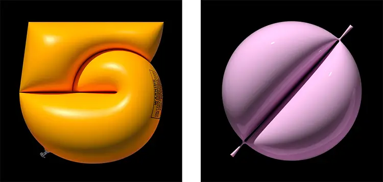
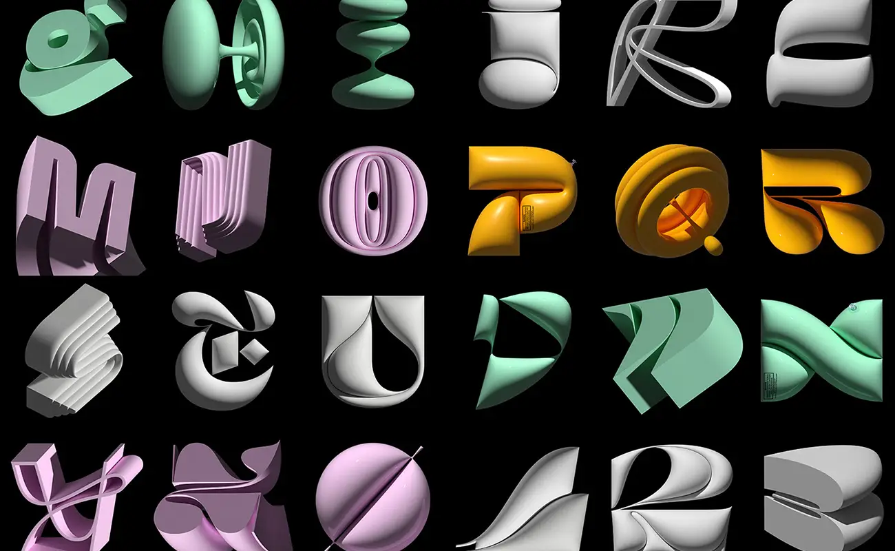
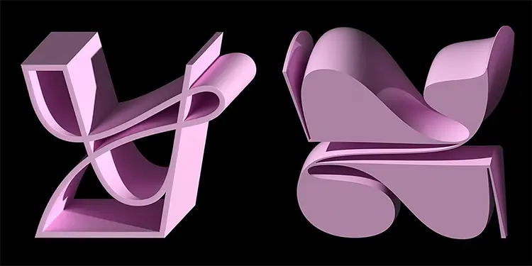
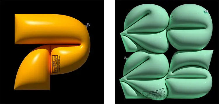
Escudeiro’s style is anchored in a profound fascination with letterforms, yet he transforms them into hybrid entities that blur boundaries between text and object. His glyphs appear to pulse with life—bulging, folding, and contorting like biological organisms caught in an ambiguous state of mutation. These visual distortions aren’t arbitrary; they reflect deeper conceptual themes such as vulnerability, containment, and resistance. Many of his characters echo inflatable safety equipment or biological cells under pressure, revealing a fascination with the dual nature of protection and exposure. In this interplay, typography becomes a kind of anatomy, revealing both external form and internal tension.
Materiality plays a central role in how Escudeiro constructs visual meaning. His 3D type works are often sheathed in slick, luxurious surfaces that mimic industrial design or high-end packaging. The textures are so precise—rubberized skins, surgical-grade plastics, brushed metal finishes—that they evoke a sensory response before a semantic one. In this way, his type feels designed not just to be read, but to be touched, held, and confronted. The effect is disarming, merging the clean future-facing sensibilities of product design with an almost baroque flourish of sculptural excess. This blend of the hypermodern and the theatrical contributes to a uniquely immersive aesthetic that is as seductive as it is critical.
Underneath the gloss, Escudeiro often embeds political commentary directly into his typographic forms. Phrases like “BEWARE OF MILITARIZED ASSET OLIGARCHIES IN LATE STAGE CAPITALISM” aren’t simply printed onto the surface—they are integrated into the anatomy of the letters themselves, becoming part of the object’s physical and ideological structure. This layered design strategy transforms playful, almost whimsical shapes into objects of dissent and critique. Escudeiro’s work refuses to exist in a vacuum. It acknowledges and challenges the systems—economic, cultural, political—that influence not just how we design, but what we choose to see.
Color, Code, and Cultural DNA
In his ongoing effort to shape a visual language that is both personal and local, Escudeiro consciously draws inspiration from Brazilian cultural cues rather than relying on international stylistic imports. This commitment is evident in how his compositions celebrate vibrancy and motion—elements that resonate with Brazil’s dynamic visual landscape. His color palettes swing between pastel sweetness and industrial intensity, from bubblegum pinks and mint greens to stark yellows and matte blacks. This contrast speaks to a duality in Brazilian design: a celebration of spontaneity and festivity on one side, and a confrontation with economic and political instability on the other.
His artistic voice finds one of its clearest outlets in participatory projects like 36 Days of Type, an annual global event where designers create and share a letterform each day. Escudeiro’s 2022 contribution stood out for its cohesion without rigidity. He described the collection as more unified than his 2021 series but intentionally kept space for eccentricity. This willingness to disrupt consistency in favor of experimentation reveals how he values process over polish, allowing each letter to explore a different corner of his creative vocabulary. Whether through angular constructs or bulbous inflatables, each form is treated as a stand-alone narrative.
Escudeiro’s distinctive take on digital sculpture has earned wider public attention, particularly through his collaboration with Adobe Illustrator. His illustrations have appeared on the software’s splash screens, greeting users with a burst of kinetic energy and chromatic vibrancy. These designs not only showcase his technical skill but also align with Illustrator’s ethos of limitless creative possibility. Escudeiro’s work here operates as more than a promotional asset; it becomes a gateway to imagination, setting the tone for artists and designers about to embark on their own visual experiments. In bridging personal voice with corporate platforms, Escudeiro maintains artistic integrity while reaching a broader audience.
Daniel Escudeiro: Constructing Meaning in the Age of Abstraction
The sculptural nature of Escudeiro’s typography invites viewers to engage with letters as environments rather than mere marks on a page. Each character is rendered with architectural attention, suggesting form as space, and space as meaning. His glyphs often appear suspended in transition, caught mid-fold or about to unravel—gestures that suggest instability, emergence, or collapse. These frozen moments provoke curiosity: are we witnessing a beginning, an end, or something altogether unfamiliar? In this ambiguity, Escudeiro’s work prompts viewers to reconsider how language occupies and interacts with dimensional space.
His compositions rarely lean on symmetry or uniformity. Instead, he embraces distortion and imperfection as aesthetic strategies. Whether crafting swollen letterforms that hint at inflatables or embedding symbols that recall industrial machinery, he juxtaposes the organic with the synthetic. Some characters include faux safety instructions, ventilation seams, or barcoded elements, mimicking real-world products while destabilizing their function. These inclusions infuse his typography with a manufactured realism that further blurs the line between art and object, language and device. Escudeiro’s forms might resemble consumer goods, but they refuse to serve any conventional utility. Instead, they critique the very systems they echo.
Despite the technological sheen of his work, Escudeiro’s designs are rooted in human experience. There’s a palpable sense of pressure and breath in the way his forms expand or compress. He manipulates inflation and volume not just as visual effects, but as metaphors for resilience, control, and transformation. In doing so, he positions typography as a sensory and political space—a space that invites not just observation, but participation. By collapsing the distinction between message and medium, Escudeiro creates an artistic language that is as emotionally resonant as it is intellectually rigorous.