“It’s always a series of works within one system. All the works together show the size of the project.”
Embracing Grids and Systems for Typographic Expression
Daan Rietbergen, hailing from Utrecht, The Netherlands, is a graphic designer and artist with a distinctive specialisation in typography. He takes on a variety of commissioned work from clients while simultaneously dedicating his time to personal typographic projects of an artistic nature. For Rietbergen, achieving equilibrium between these two aspects is fundamental.
The art of graffiti, a pursuit he embarked on at the tender age of 13, played a pivotal role in moulding both his artistic approach and personal development. Rietbergen has garnered invaluable insights from both the positive and negative facets of this medium. His initial foray into the art was primarily focused on volume over finesse. This involved mastering the ‘rules’ of graffiti, controlling the unpredictable nature of spray cans, and learning from inevitable missteps.
Throughout his artistic journey, Rietbergen’s style underwent a gradual evolution. His initial style, marked by expressiveness and vibrancy, slowly transformed as he experimented with different letter combinations within a singular style, aiming for recognition beyond his tag alone. In a surprising twist, the spontaneity and color of his earlier work gave way to a more controlled, grid-based approach where precision according to his own set guidelines took precedence.
His tenure at Studio Dumbar, a renowned graphic design studio in Rotterdam, has left an indelible imprint on his style. Upon graduating in 2014, Rietbergen joined the studio, finding it a perfect platform to channel his creativity into designing visual identities. As the allure of graffiti waned, this new avenue provided an enriching outlet for his creativity.
After a productive half-decade with Studio Dumbar, Rietbergen felt an irresistible urge to produce original work unfettered by client demands. This manifested a desire for increased artistic freedom, a testament to his commitment to personal creative exploration.
Daan Rietbergen: Enlivening Public Spaces and Paper with Distinctive Characters
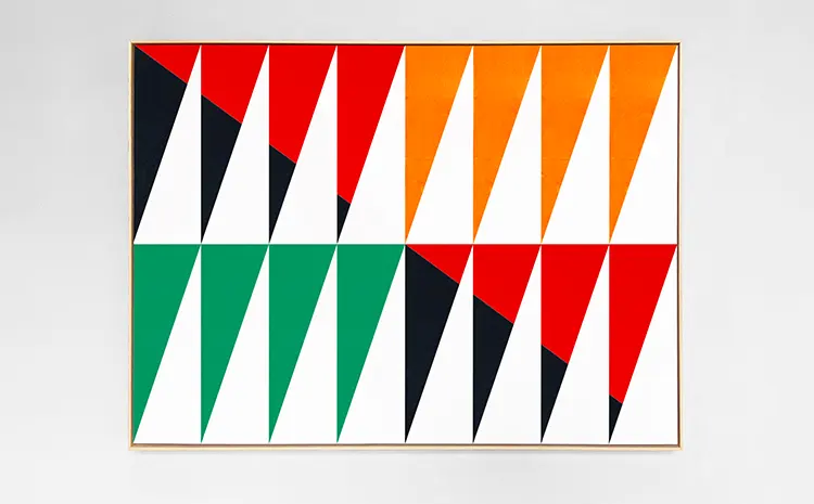
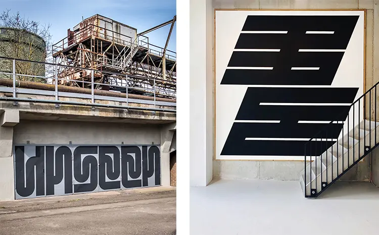
The creative expression of Daan Rietbergen is deeply rooted in the principles of grids and systems. His typographic ventures frequently find themselves governed by self-imposed rules, which, in certain instances, may supersede legibility. Rietbergen views alphabetic symbols almost anthropomorphically; they are living characters that, while belonging to a harmonious family, also possess the compelling ability to assert their individuality.
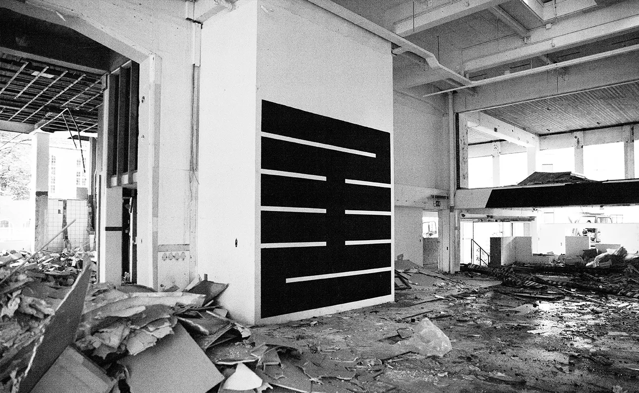
His typographic entities frequently occupy public spaces, where they imbibe a heightened vivacity. In his creations, Rietbergen navigates a delicate equilibrium between minimalism and audacity, cultivating distinctive and impactful shapes.
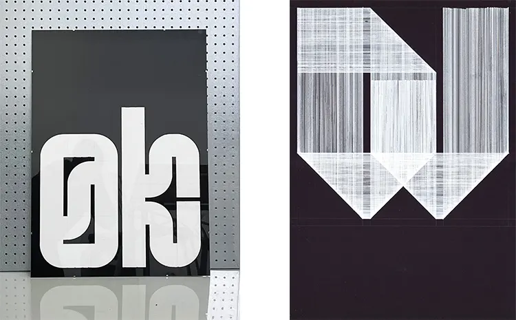
In addition to enlivening public spaces with his characters, Rietbergen expresses a profound affinity for working on paper. The medium’s fragility offers an intriguing counterpoint to the robust nature of his creations. The choice of materials for each project is dictated by its unique requirements.
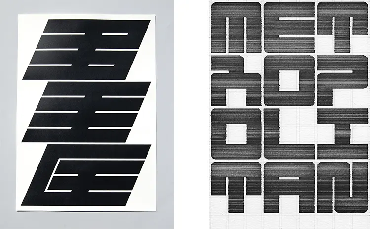
Take, for instance, the Nespor typographic project: it was initiated digitally and then further evolved on paper. Here, Rietbergen employed fineliners and a ruler to meticulously sketch out each character, a process imbued with a meditative quality that is reflected in the output.
On the other hand, for the Vimeto typographic system, Rietbergen sought to manifest a sense of visual weight. To achieve this, he used acrylic paint to render the characters entirely black, thereby maximizing contrast and imbuing the forms with an undeniable potency.
Drawing Inspiration from Design Pioneers and Dutch Artists
Daan Rietbergen’s unique graphical language is unquestionably molded by the influence of renowned Dutch graphic designers from the 1960s, such as Wim Crouwel, Ben Bos, and Jurriaan Schrofer. These design pioneers excelled in their creative prowess, uniquely crafting typography to engender impactful imagery. Rietbergen, to this day, draws inspiration from the multifaceted nature of graffiti, a testament to the infinite possibilities of letter formation. In parallel, he acknowledges the influence of fellow Dutch artists such as Jeroen Erosie and Erris Huigens, whose public space works have significantly informed his artistic approach.
Distractibility has often been a trait inherent to Rietbergen’s persona, making the serene solitude of his studio an absolute boon. Nestled amidst lush gardens, this tranquil haven is blessed with an abundance of natural light; a feature that not only enhances the work environment but also positively impacts the artist’s overall state of mind. In the contemporary world, where digital distractions from smartphones, social media, laptops, and emails are incessantly vying for attention, Rietbergen has implemented a disciplined regimen. For several months, he has been diligently focusing on his work for uninterrupted hour-long stints, strategically punctuated by breaks lasting fifteen to thirty minutes. During these intermissions, he engages in refreshing walks outdoors or partakes in meditation, effectively rejuvenating his mind for another round of concentrated work.
While the drive to pursue personal projects often outstrips the lure of distractions for Rietbergen, the artist understands the need to pace himself. On occasion, he deliberately decelerates, allowing his work to breathe and evolve. Such a measured approach helps prevent the pitfalls of non-stop labor, thereby safeguarding his physical well-being and ensuring the longevity of his artistic career.
Daan Rietbergen: Balancing Creativity, Solitude, and Discipline for Artistic Longevity
Daan Rietbergen’s artistic vision is rarely encapsulated in a single piece of work. Instead, his creative oeuvre is more akin to an interconnected constellation where each work exists as an integral part of a broader system. This systemic approach, he contends, enables the viewer to appreciate the full scope of the project.
A vivid illustration of this methodology can be observed in Nespor, Rietbergen’s inaugural typographic art project. In this venture, he meticulously crafted a specimen book, an artifact he holds in high esteem due to its comprehensive encapsulation of the project’s extent and commitment. This endeavor also marked a rekindling of his past affinity for creating typographic characters in public spaces, an activity that harkens back to his graffiti-writing days. However, Rietbergen’s current approach signifies a marked evolution from his past, placing greater emphasis on the careful integration of the artwork within its environmental context.
Currently, Rietbergen’s creative pursuits have led him to a collaboration with renowned fashion designer, Korinna van Balkom. This innovative venture involves the design of twenty-six fashion pieces, each featuring the integration of a single letter, sequentially from ‘A’ to ‘Z’. The project commenced with a Kimono adorned with the letter ‘A’. Rietbergen finds the application of typographic forms on fashion items compelling due to the unique opportunity it provides to explore the artwork in a three-dimensional context.
In addition to this, Rietbergen expresses a keen interest in the creation of a substantial mural — envisioning a height of 20 meters — as a means of further accentuating the impact of his typographic characters. In this way, he continues to push the boundaries of his art, ever redefining and expanding his creative horizons.
