“Glass hides nothing: the lines, the colours you can experience in transparency, the layering and the reflection along the edge.”
Awakening to Space, Light, and the Language of Colour
Daphne Rijkoort’s artistic journey is rooted in a formative encounter with space that reshaped the way she perceives the world. At eleven years old, she stood inside the Guggenheim Museum in New York, overwhelmed by the spiraling architecture that seemed to move around her. The building’s sweeping curves, shifting daylight, and fluid openness created an experience that felt alive and immersive. Rather than simply observing art on the walls, she felt absorbed into a total environment where volume, light, and movement were inseparable. That early moment planted a seed that would only reveal its meaning years later. Although she did not immediately imagine herself becoming an artist, the sensation of being surrounded by form and colour remained with her. The memory of walking upward through the museum, feeling both grounded and lifted, continues to echo in her practice, where space is never static and perspective is always in motion.
During the same trip, a visit to the Museum of Modern Art deepened her quiet curiosity. Even as a child, she found herself searching beyond the visible surface of artworks, wondering what existed behind them or within them. This instinct resurfaced years later when she encountered Rembrandt’s The Night Watch in Amsterdam. Viewing the painting from the side rather than directly in front of it changed everything. From that angle, she sensed the layers, the physical depth, and the hidden dimensions of the composition. The painting no longer appeared as a flat image but as a living structure with space embedded inside it. That revelation clarified what she had been seeking since childhood: the experience of entering a painting rather than merely observing it. Since then, she has approached art from shifting viewpoints, convinced that meaning often reveals itself when one dares to look differently.
Colour also played a defining role in her early development. She spent her childhood savings on coloured pencils, searching for hues that felt luminous and complete. Yet when applied to paper, those colours frequently failed to match her expectations, lacking the intensity she envisioned. This disappointment became a catalyst for exploration. She began investigating how colours could enhance one another, how they might vibrate, contrast, or stand independently with clarity. For Rijkoort, colour became more than decoration; it became a source of healing and balance. The idea of “elevating colours,” tones that lift and activate each other, emerged from this persistent search. Her chosen artist name reflects this deep connection to chromatic experience. Over time, colour transformed into both subject and medium, guiding her toward a practice in which light, transparency, and layered surfaces allow pigments to breathe and interact in ever-changing ways.

Daphne Rijkoort: From Spatial Design to Painting on Glass
Before fully committing to painting, Rijkoort followed a different academic path, studying Hotel Management. An internship in Barcelona became a turning point. Immersed in a city where architecture, music, and visual culture intertwine effortlessly, she felt inspired by its vitality and historical depth. Long walks through its streets sharpened her sensitivity to spatial rhythm and atmosphere. The experience nurtured a philosophical and poetic outlook, encouraging her to translate sensations of place into visual form. After completing her degree, she chose to pursue spatial design at the Willem de Kooning Academy in Rotterdam. There, she encountered the concept of spatial painting, a discovery that aligned perfectly with her childhood impressions of immersive architecture and layered artworks. This educational shift marked the beginning of her commitment to creating works that exist not only as images but as environments, objects that invite viewers to move around them and experience them physically.
When she returned to painting in 2017, the year she turned thirty, a new chapter unfolded. Revisiting The Night Watch reinforced her fascination with dimension and perspective, encouraging her to rethink the very structure of painting. She began working on paper, gradually stripping images down to minimal lines while leaving generous areas untouched. Strong curves and transparent layers emerged as defining elements, often executed in bright Neopastel tones. Initially, each piece required months of concentrated effort. Transitioning to white linen intensified the vibrancy of her colours and softened her lines, allowing her to work more freely. Over time, she prepared raw linen with gesso herself, enabling her to paint on both sides and expand the scale of her compositions. Instead of confining the works within traditional frames, she placed them between sheets of glass, transforming them into floating objects that transcend conventional painting.
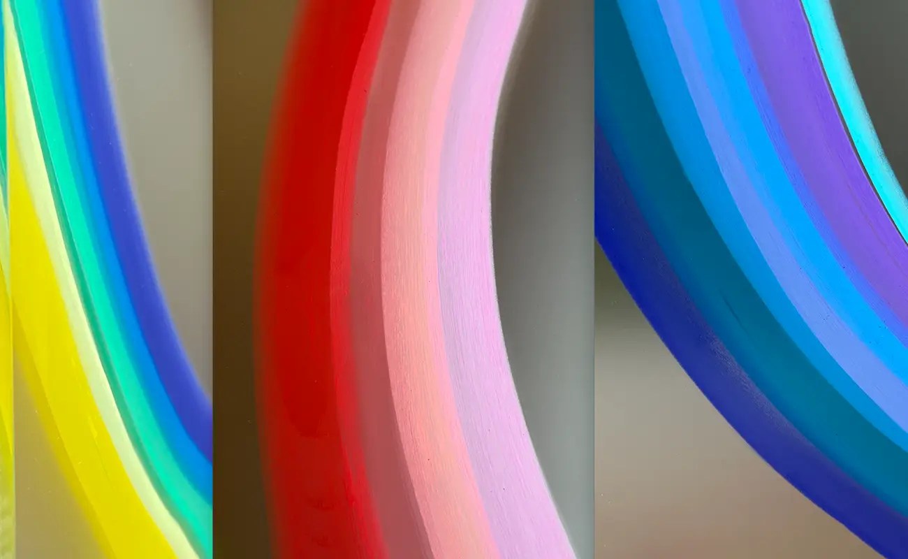
Her exploration continued with coloured PVC foil, whose transparency allowed light to pass directly through the surface. This shift altered not only the presentation but also her working method. Rather than painting solely on an upright easel, she began placing materials flat on the ground, rotating them as she worked. This freedom generated shapes that would not emerge on a fixed surface. Since 2023, she has focused increasingly on painting directly onto glass using Neopastel. The discovery began with a leftover piece of glass in her studio, yet she immediately recognized its potential. Glass offers no opportunity for easy correction; each mark demands confidence and presence. Satin glass in particular complements the softness of her finger-drawn lines. Transparency, reflection, and shifting daylight create compositions that transform throughout the day, encouraging viewers to circle the work and witness its subtle changes from multiple angles.

Liberated Forms, Feminine Strength, and the Influence of Masters
Rijkoort’s current style is defined by transparency, renewal, and the liberation of form. Using a restrained number of lines, she constructs shapes that appear to float or defy gravity, often extending visually beyond the edges of the glass. These forms feel dynamic and light, yet they carry emotional depth. The layered quality of her compositions invites prolonged observation, revealing different interactions between colour and space over time. Her works are distinctly feminine, not in a literal sense but in their sensitivity, curvature, and sense of protection and openness. Transparency plays a crucial role, allowing viewers to see through the work while simultaneously encountering reflections of colours and their surroundings. This interplay between visibility and concealment reinforces her belief that art should be experienced gradually, discovered piece by piece rather than grasped instantly.
Historical and contemporary influences inform her practice without overshadowing her individuality. She studies artists from previous generations to understand what motivated them and how they shaped visual language. Kandinsky’s exploration of liberated shapes and the expressive power of the dot resonates deeply with her approach. Van Gogh’s intensity of colour, Rembrandt’s inquisitive spirit, and Matisse’s dedication to process also provide inspiration. Architecture remains equally important, particularly the impact of buildings she encountered in childhood. Music, especially compositions by emerging artists, frequently accompanies her creative process. When sharing her work on Instagram, she often pairs images with the music that influenced their creation, highlighting the connection between sound and visual rhythm. Encounters with other creatives, whether painters, musicians, architects, or philosophers, reinforce her commitment to exploring shared questions about space, perception, and human connection.
Central to her philosophy is the idea that a powerful artwork invites repeated viewing. She does not expect immediate understanding from her audience. Instead, she hopes that something within the composition catches the eye and encourages a pause. A painting should offer an expansive experience, one that continues to reveal new aspects over time. This belief stems directly from her childhood encounters with monumental spaces and masterworks that felt all-encompassing. She seeks to create a universal visual language, detached from a specific moment or location, where viewers can immerse themselves and find personal meaning. By prioritizing openness over explanation, she allows each observer to form a unique relationship with the work. In this way, her art becomes an ongoing conversation between colour, light, and perception.

Daphne Rijkoort: The Egg, Head Up High, and the Seasons of Creation
Among her most meaningful works is The Egg, a painting that embodies the profound bond between mother and child. Created with her characteristic use of layered colour and gentle curvature, the piece presents a child nestled within a protective, shell-like form. The figure gazes outward with curiosity, suggesting both safety and independence. This painting reflects her relationship with her daughter, balancing protection with freedom. The medium reinforces the message: transparency and layered colour emphasize connection while allowing space for growth. Another significant work, Head Up High, carries a different yet equally powerful intention. Inspired by winter light, frost, and the quiet strength of January landscapes, it encourages viewers to lift their gaze and expand their perspective. Looking upward, the world feels larger and more hopeful, reminding us that we exist within a vast and interconnected whole.
Her daily practice mirrors the rhythms of nature. No two days are identical, and her colour choices shift accordingly. A deep purple used one week may appear alongside greens and yellows in one composition, then transform when paired with blues or reds in another. Seasonal changes influence her emotional tone and subject matter. She senses the arrival of spring even in midwinter, and that anticipation subtly guides her palette. The Egg, painted in March, carries the first suggestion of renewal, while Head Up High reflects the clarity and quiet resilience of winter. Looking ahead, she envisions scaling up her forms so that viewers can physically walk around them, fully experiencing their liberation in space. Recent experiments include cutting painted glass panels into fragments, rearranging them to alter composition and lighten their physical presence. Through continuous experimentation and shifting perspective, she sustains an evolving dialogue between colour, light, and human experience.
Daphne Rijkoort’s Website: www.thecolourartist.com