
“I gravitate toward material-based typography, treating text not only as a printed form but as something that can be woven, carved, layered, or deconstructed.”
A Designer Who Sees Language Beyond Words
Jie Jian is a distinguished graphic designer and type designer whose work investigates the relationship between language, visual storytelling, and materiality. Her fascination with the physicality of text—how letterforms convey meaning beyond their literal definitions—has shaped her innovative approach to typography. Rather than treating type as a mere vessel for communication, she explores its potential as a structural and expressive medium, blurring the boundaries between design and fine art.
Her academic journey played a crucial role in refining this perspective. At the Rhode Island School of Design (RISD), she studied Graphic Design while briefly double-majoring in Glass and later minoring in Computation. These interdisciplinary influences deepened her understanding of form, structure, and digital interactivity, which became integral to her work. Further honing her expertise, she pursued advanced studies in typography through the Type@Cooper program at Cooper Union, where she explored the intricacies of letterforms and their communicative power.
Jian’s professional experience spans prestigious institutions such as the Walker Art Center and Urban Art Projects (UAP), where she engaged with exhibition design, publication design, and research-driven typography. Her explorations in bookmaking and fiber arts have also enriched her practice, allowing her to experiment with text as a tangible, multidimensional entity. Through these diverse experiences, she continues to push the limits of typographic storytelling, crafting work that challenges conventional perceptions of language and design.
Jie Jian: The Evolution of a Typographic Visionary
Jian’s creative journey began with an intrinsic curiosity about the silent, visual power of text. Long before formal training, she was captivated by how a word’s shape could influence its emotional resonance and how its arrangement could alter interpretation. This fascination eventually became the foundation of her artistic identity, leading her to approach typography as more than a tool—it became her medium.
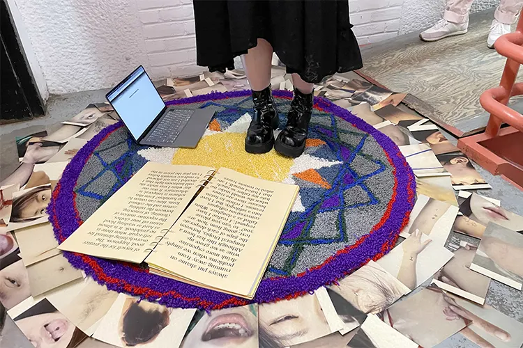
While studying at RISD, she explored the tension between legibility and abstraction, deconstructing letters to create unexpected visual forms. This inquiry reached a pivotal moment in her senior thesis, Sinful Magical Girls, an experimental project that intertwined typography, bookmaking, and interactive design to examine themes of self-identity and femininity. The project’s innovative approach earned recognition from the Indigo Design Awards and Tokyo Type Directors Club, solidifying her belief that typography could transcend traditional formats to become a storytelling device in its own right.
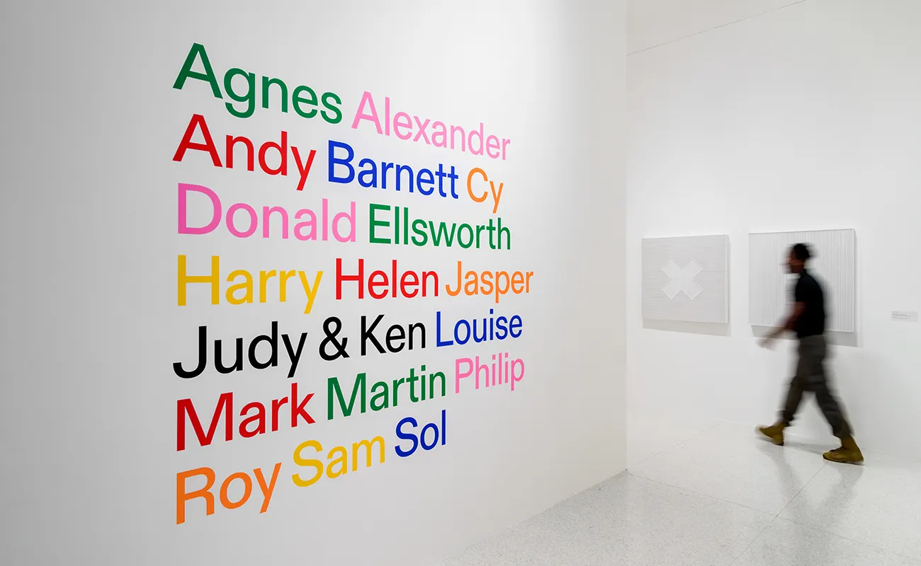
Following graduation, Jian sought opportunities to further develop these ideas. At the Walker Art Center, she worked on the exhibition graphics for Among Friends, a project that required her to design a typographic system reflecting personal connections between artists and collectors. This experience deepened her interest in how typography functions in physical spaces, inspiring her to consider its potential to foster intimacy and dialogue. Through this work, she continued refining her ability to merge conceptual storytelling with spatial design, ensuring that typography was not just seen but also felt.
Materiality, Memory, and the Transformation of Text
Jian’s artistic practice is deeply rooted in the physicality of language, exploring how text can extend beyond printed surfaces into material and sculptural forms. Her work frequently integrates fiber arts, weaving, and layering techniques to investigate how words can be carved, stitched, or deconstructed. This tactile approach allows her to reimagine typography not as static symbols on a page but as evolving structures shaped by their environment.
Themes of linguistic memory, absence, and transformation run throughout her work. She is particularly drawn to how language changes over time—how words disappear, resurface, or shift in meaning. This interest has led her to experiment with generative text systems, using algorithms to fragment and reassemble words into new poetic forms. By juxtaposing traditional craftsmanship with digital innovation, she explores how technology can reinterpret and recontextualize historical and cultural narratives.
Jian’s approach to design extends into her workspace, where she maintains a balance between precision and experimentation. She often toggles between digital tools and hands-on materials, relying on historical type specimens, artist books, and poetry collections for inspiration. To maintain focus, she engages in what she describes as “text-based meditation,” a practice that involves analyzing letterforms, reading aloud, or physically manipulating text. When distractions arise, she turns to alternative creative outlets—whether weaving, coding, or cooking—to reset her perspective before returning to her work with renewed clarity.
Jie Jian: The Power of Absence in Typography
Jian’s artistic influences span multiple disciplines, from conceptual art to concrete poetry. Among them, she finds inspiration in the work of Seiichi Niikuni, a Japanese poet who explored typography’s spatial and rhythmic potential. His ability to distill language into its purest visual essence has significantly shaped her approach, reinforcing her belief that text can communicate meaning even when stripped of conventional syntax.
One piece that has profoundly impacted her perspective is Arc of Total Eclipse by Sarah Charlesworth, a work that presents 29 newspaper front pages documenting the solar eclipse of February 26, 1979. In this series, Charlesworth removes all text except for the mastheads and eclipse photographs, transforming news coverage into a purely visual narrative. The result is a meditation on media construction, highlighting how information is shaped by editorial choices and what is included or omitted.
Jian sees this work as a crucial commentary on media transparency and the influence of visual culture. It underscores how absence can be as powerful as presence—how erasure can prompt deeper engagement with what remains. This idea continues to resonate in today’s digital landscape, where information is curated and manipulated to frame specific narratives. Charlesworth’s approach aligns with Jian’s own explorations in typography, reinforcing her belief that language is not just about what is written but also about what is left unsaid.